Standing still - a performance tinker
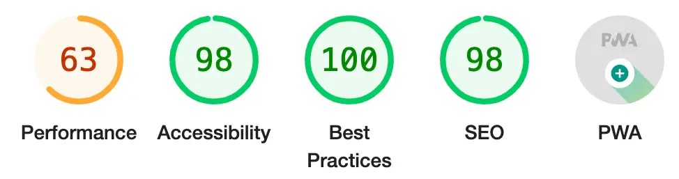
Posted on in WebWhen I launched this site, it hit 100’s across the board on Lighthouse. Using a static site generator and very little JS did most of the heavy lifting. But when I checked a couple of days ago, things weren’t looking so rosy.
I’ve been standing still while the performance world has moved on. It’s exciting - not only is there plenty of room for improvement, it shows the benchmarks are moving in the right direction. We have new image formats, new loading technqiues, heck, even a new HTTP protocol available, so it we should expect better performance than 5 years ago, even if the JS-fuelled reality of the web suggests otherwise.
Images
Image formats
First up, image formats. This is the lowest of the low hanging fruit. WebP and AVIF both launched since I built this incarnation of my site. Images account for 526 kB / 702 kB sent down the wire to render my home page. Squoosh to the rescue. Once all the images are converted, I can update the markup with the <picture> element:
Before
<img src="images/trysmudford.jpg" alt="Photo of Trys Mudford, standing, smiling and facing the right" />
After
<picture>
  <source srcset="images/trysmudford.avif" type="image/avif" />
  <source srcset="images/trysmudford.webp" type="image/webp" />
  <img src="images/trysmudford.jpg" alt="Photo of Trys Mudford, standing, smiling and facing the right" />
</picture>
The result? 117 kB / 435 kB. A whooping 409 kB saved! Turns out, I’d previously converted my hero photo to WebP, trying to be a good citizen, but clearly done a bad job of it, as it was four times larger than the compressed JPG it was replacing!
Image loading
Native lazy loading is such a great web platform feature, and effortless to add. Popping loading="lazy" to any image (below the fold) will defer the image network request until the browser scrolls close enough to the element to need it.
Image width & height
Cumulative layout shift can be exacerbated by lazy loading images, so we can use the width/height attributes to give the browse a clue as to how large the image will be, before it makes the network request. It can then plot out the space required and reduce expensive shifts to the page layout when the image does load.
Accessibility
Heading order
The only accessibility warning was about heading-level orders. The side projects on the site used H3’s where H2’s would’ve been more appropriate. A nice quick win.
Tap target size
The final warning was about tap target sizes, namely for the category links that sit next to each blog post. Given the tricky rotation applied to them, I feared this might be a bit fiddly. I was wrong, a quick addition of padding: var(--space-2xs); handled it rather nicely.
Result
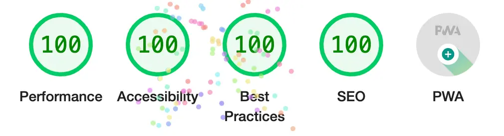
And with that, we’re back to 100’s across the baord. I’ve shaved nearly half a megabyte off the page size and improved the accessibility along the way. Not bad for an evening of tinkering.
Posted on in Web