Fluid & space-aware components
Posted on in WebLet’s be honest, we’re all just waiting for container queries to drop. We know breakpoints are arbitrary, and we’d desperately like to create components that work in any situation, but that’s not really possible right now.
Heydon and Andy’s amazing ‘Sidebar’ creation goes a long way to help remove media queries from within components and render them intrinsically. But that’s layout, I’m interested in type and space.
How do you get components to respect the rendering conditions of their parent?
James and I released Utopia a year ago, and since then, it has become the backbone of our typographic design process. The combination of beautiful fluid typography & a common language between designer and developer has made building websites a thoroughly more joyful experience.
One minor limitation of Utopia is that it ‘assumes’ the typographic scales run at 100vw, the full width of the screen. It uses CSS locks under the hood, so the type sizes are capped off at a sensible point, but till that point, it doesn’t care where your text is rendered. If you’re displaying text in a sidebar, card or main content area, each step size is always the same size.
In many ways, this is good. One of the points of a type scale is to promote visual consistency between items. If there is a harmonious scale tying typography together, then everything is ‘in tune’ with itself.
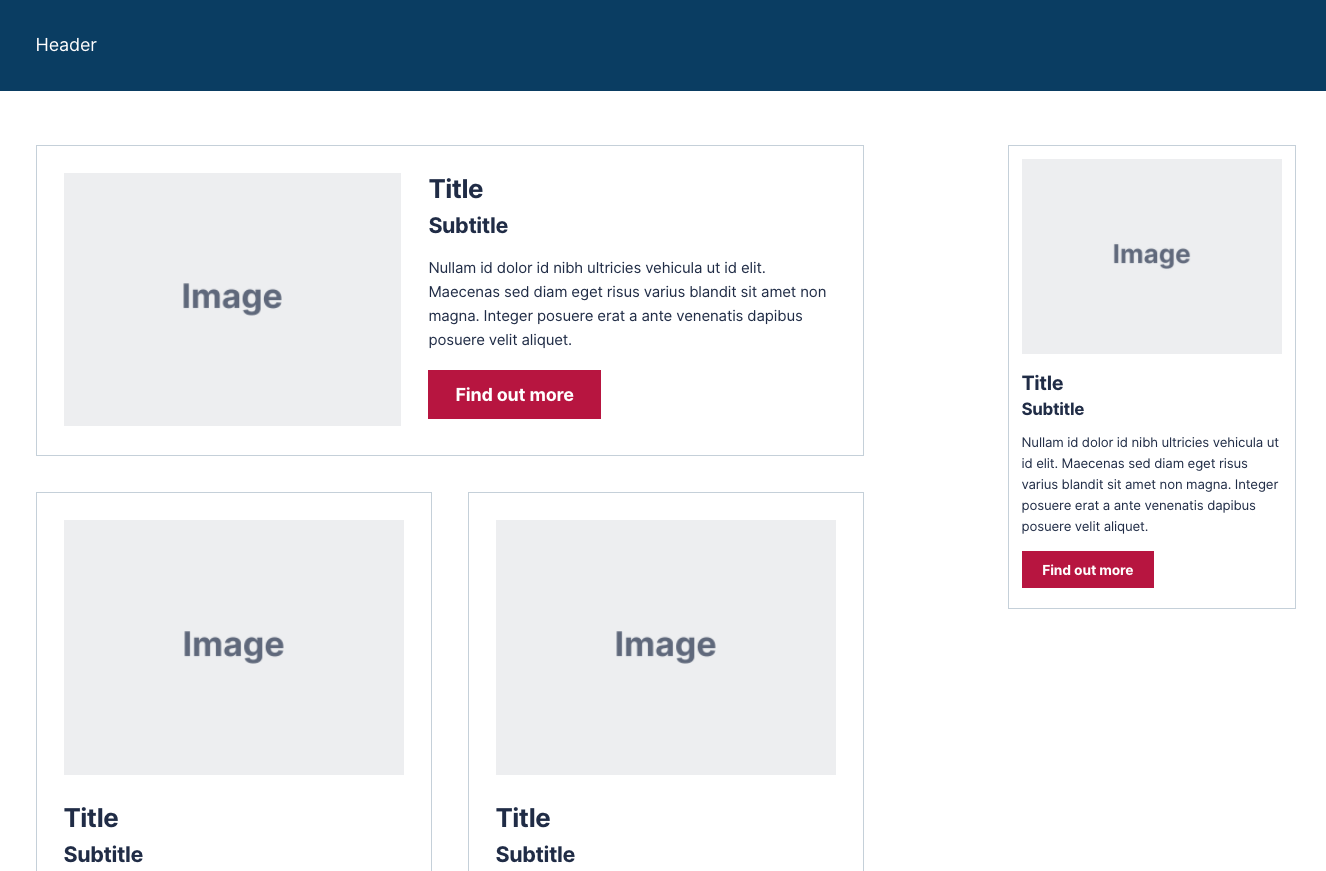
There are occasions, however, where it would be really nice to reduce the size of the type within a certain section, let’s say: the sidebar. The sidebar is a place for secondary content, thus should attract less visual attention than the main content area. The problem is pretty visible in this example. The card and alert components in the sidebar are visually ‘too loud’.
Elements should still be ‘in tune’, but perhaps pitched a little lower?
One option would be to multiply each step of the scale by say, 0.5. It would have the desired effect of reducing the font size, but depending on the scales you chose, could leave unnatural gaps between steps. You’d be reducing the sizes, but not the scales that they follow, and that’s an issue. But it got me thinking:
What if, rather than alter the individual ‘sizes’ of the items in the scale, we could render the whole scale as if it were at a totally different viewport?
I think it makes some sense. We’ve already designed and built our components to work on small screens, so why not render them in that context when used in a sidebar?
Furthermore, while we (currently) can’t know how big every component is on the screen (without JS), we do tend to know how big a sidebar is at any one time, either as a percentage of the viewport, or as a fixed size.
Transposing the modular scale
The whole approach of my work refactoring CSS locks was centred around locking the ‘screen’, rather than the individual values. This iteration on the concept meant you could write hundreds of locks with only one media query:
:root {
  --fluid-min-screen: 20;
  --fluid-max-screen: 80;
  --fluid-screen: 100vw;
  --fluid-bp: ((var(--fluid-screen) - calc(var(--fluid-min-screen) * 1em)) / (var(--fluid-max-screen) - var(--fluid-min-screen)));
}

@media screen and (min-width: 80em) {
  :root {
    --fluid-screen: 80em;
  }
}

h1 {
  font-size: calc(3em + (5 - 3) * var(--fluid-bp));
}

h2 {
  font-size: calc(2em + (4 - 2) * var(--fluid-bp));
}
At the time, I remember looking at that --fluid-screen: 100vw on line 4, and thinking: “there’s something worth investigating there”. But client projects and life happened and I didn’t have a chance to dig in. But I’ve finally had the headspace to explore.
Demo time
Here’s a demo of the concept in action, moving on from the earlier problematic version. Every instance of the ‘card’ and ‘alert’ components are running exactly the same HTML as their siblings, whether rendered in the sidebar or main body. Using the sidebar approach, the card itself has no media queries, and is sized intrinsically by the content within. There is one media query used to place the sidebar to the right of the content area at 55em.
Crucially, when that media query matches, we also override the --fluid-screen custom property and instruct the browser to render all typography within as if the screen was 320px wide. One property set, and all the components within the sidebar scale down in unison.
Test it, drag your viewport down to 320px and see how the card is rendered. Now, as you bring it back out, watch the bottom card grow in exactly the same way as its siblings until it jumps into to the sidebar.
And this is set for all components in the sidebar, it doesn’t matter what goes in, if it’s using the type scales, the component is rendered in the smaller state. Despite using ‘global’ typographic styles, the changes cascade down like good ol' CSS was meant to do.
How does this work?
Here’s the code in play:
.root,
:root {
  --fluid-min-width: 320;
  --fluid-max-width: 1332;

  --fluid-screen: 100vw;
  --fluid-bp: calc(((var(--fluid-screen) * var(--fluid-multiplier, 1)) - var(--fluid-min-width) / 16 * 1rem) / (var(--fluid-max-width) - var(--fluid-min-width)));
}

.root {
  font-size: var(--step-0);
}

@media screen and (min-width: 83.25em) {
  .root,
  :root {
    --fluid-screen: calc(var(--fluid-max-width) / 16 * 1rem);
  }
}

.root,
:root {
  --f--1-min: 13.33;
  --f--1-max: 15.00;
  --step--1: calc(((var(--f--1-min) / 16) * 1rem) + (var(--f--1-max) - var(--f--1-min)) * var(--fluid-bp));

  --f-0-min: 14.00;
  --f-0-max: 18.00;
  --step-0: calc(((var(--f-0-min) / 16) * 1rem) + (var(--f-0-max) - var(--f-0-min)) * var(--fluid-bp));

  --f-1-min: 17.20;
  --f-1-max: 21.60;
  --step-1: calc(((var(--f-1-min) / 16) * 1rem) + (var(--f-1-max) - var(--f-1-min)) * var(--fluid-bp));

  --f-2-min: 20.04;
  --f-2-max: 25.92;
  --step-2: calc(((var(--f-2-min) / 16) * 1rem) + (var(--f-2-max) - var(--f-2-min)) * var(--fluid-bp));

  --f-3-min: 24.65;
  --f-3-max: 31.10;
  --step-3: calc(((var(--f-3-min) / 16) * 1rem) + (var(--f-3-max) - var(--f-3-min)) * var(--fluid-bp));
}
Custom properties cascade, but their calculations do not. So if you’re using --step-2 and try and alter the --fluid-screen on that sidebar directly, it sadly won’t recalculate the size. No cascade yet.
However, we can use a class. As well as building the custom properties onto the :root selector, we also attach them to a .root class. Now, if we want to override the ‘rendering context’ of child components, we pop this class onto the HTML, in our case, onto the sidebar.
<div class="o-grid o-grid--8/3">
  <main class="u-flow--gutter">...</main>

  <aside class="u-flow root">
    {{ cardHTML | safe }}
  </aside>
</div>
This on it’s own does nothing, but it sets us up to override that --fluid-screen property when we need to:
@media (min-width: 55em) {
  .o-grid--8\/3 > :nth-child(2n+2) {
    width: grid-column(4);

    --fluid-screen: 20em;
  }
}
And that value can be pretty much anything:
20rem320px50vwmin(320px, 35vw)
Using a fluid value will allow the sidebar elements to keep ‘growing’ but at a slower rate, whereas a fixed value will lock them in. The decision is up to you.
What else can you do?
Well, you know I said you couldn’t use a decimal reduction earlier… I was lying a little bit! You can’t reduce the ‘scale’ by a set amount, but you can reduce the screen size by a decimal with a --fluid-multiplier. Here we’re saying ‘render the child components as if the screen were 75% of the current size’.
@media (min-width: 55em) {
  .o-grid--8\/3 > :nth-child(2n+2) {
    width: grid-column(4);

    --fluid-multiplier: .75;
  }
}
What about space?
This 100% works with space, as well as type. James and I have been working on a huge update to Utopia, specifically around space and it ties into this perfectly. We’ll be publishing the space update soon!
Is this useful?
Honestly, I’m not sure yet! It has been burning a whole in my head for near-on a year and I’m so glad to have finally got it out. I’d love to hear of any ideas, use-cases and improvements so please holler at me!
Posted on in Web