Mac OS Dark Mode with CSS & JS
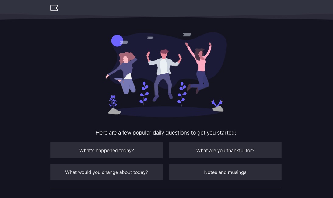
Posted on in WebI’ve been using the commute to add a few JournalBook features. Yesterday saw the addition of the prize feature everyone loves but very few need: Dark Mode! Here’s how it was built:

Getting the CSS in order
First on the task list was preparing the CSS for the changeover. As someone who absolutely loves CSS, I’m a little ashamed by the state of it on this project. It’s due a major refactor, but let’s not dwell on that too much!
All the colours were hard-coded, and scattered among the CSS file - a consolidation was required. I tend to write .scss, but this project is still set up with humble ol' CSS. No matter, it’s 2019, we have ✨ Custom Properties! ✨
To start with, I moved all the colours up to a single :root declaration and set them up as variables.
:root {
  --bg: #fff;
  --color: #444;
  --line: #ddd;
  --heading: #1e2357;
  /* ... */
}
Then I swapped out all references in the remainder of the CSS.
#app {
  background: var(--bg);
  color: var(--color);
}
Finally, to create the dark mode style, I copied the :root variable rules, and created a ‘theme’.
[data-theme='dark'] {
  --bg: #131420;
  --color: #efefef;
  --line: #555;
  --heading: #c5c5c5;
}
Thanks to the 🔥 wonderful cascade 🔥 (big fan in case you’re wondering), these variables are updated for any child elements.
So from a HTML point of view, theme switching is a case of changing one data attribute on one element. Nice.
JS theme switching
JournalBook is written in Preact, so this code will be a bit ES6’y.
Here’s the base App class. We call getDefaultTheme() (which I’ll stub out in a mo') to set our initial state, then render the app with the aforementioned data attribute.
class App extends Component {
  state = {
    theme: getDefaultTheme()
  };

  render(props, { theme }) {
    return (
      <div id="app" data-theme={theme}>
        {/* The rest of the app */}
      </div>
    );
  }
}
In getDefaultTheme(), we first check to see if the theme has been explicitly set by the user. If so, we return it. Next, we run a matchMedia call to see if they’ve set their OS to have the dark colour scheme. This is part of CSS Media Queries level 5, and can be read up on here. It’s only currently available in Safari tech preview, and on OS Mojave, so admitedly, this part is a niche feature. Finally, we return an empty string, which we’ll class as a preference for the default theme.
const getDefaultTheme = () => {
  const userTheme = localStorage.getItem('journalbook_theme');

  if (userTheme !== null) {
    return userTheme;
  }

  if (window.matchMedia('(prefers-color-scheme: dark)').matches) {
    return 'dark';
  }

  return '';
};
This all works really nicely! If you’ve set a theme, you get it. If not, you get the most appropriate theme for your system preferences.
Sidenote
This can also be achieved in CSS, with the media query:
@media (prefers-color-scheme: dark) {
  /*  */
}
But for the JournalBook use case, we need to first check to see if a user has explicitly set their own theme first, hence the JS involvement.
Live system switching
There is a minor issue with the current code: it doesn’t react live to system-level contrast mode changes. Is that even possible, I hear you cry! (I asked the very same question till Jason Miller came to the rescue).
I had no idea you could use addListener on window.matchMedia! (another sidenote, my mind is whizzing at the possibilities with this new information).
With that, we can add a listener and respond to system preference changes live in the browser!
componentDidMount() {
  if (localStorage.getItem('journalbook_theme') === null) {
    window.matchMedia('(prefers-color-scheme: dark)').addListener(({ matches }) => {
      this.setState({ theme: matches ? 'dark' : '' });
    });
  }
}
Check out Jason’s video of the switch in action!
Manual switching
The final piece of the puzzle is the manual theme picker. Thanks to our embrace of the cascade and CSS custom properties, it’s not too bad to implement.
class Settings extends Component {
  state = {
    theme: getDefaultTheme()
  };

  updateTheme = event => {
    const theme = event.target.value;
    localStorage.setItem('journalbook_theme', theme);
    document.querySelector('#app').dataset.theme = theme;
    this.setState({ theme });
  };

  render(props, { theme }) {
    return (
      <form>
        <label for="theme">Theme</label>
        <select id="theme" onChange={this.updateTheme} value={theme}>
          <option value="">Default</option>
          <option value="dark">Dark</option>
        </select>
        {/* The rest of the settings form */}
      </form>
    );
  }
}
JournalBook doesn’t yet have any global state, so we have to manually set the data attribute, which is less than ideal. But I reckon it’s fine for what is a single attribute change for live theme switching.
In closing
I wanted to extend a massive thanks to Jason for demonstrating matchMedia listeners so aptly! I can’t wait to experiment with them more!
Posted on in Web