It's all about that space
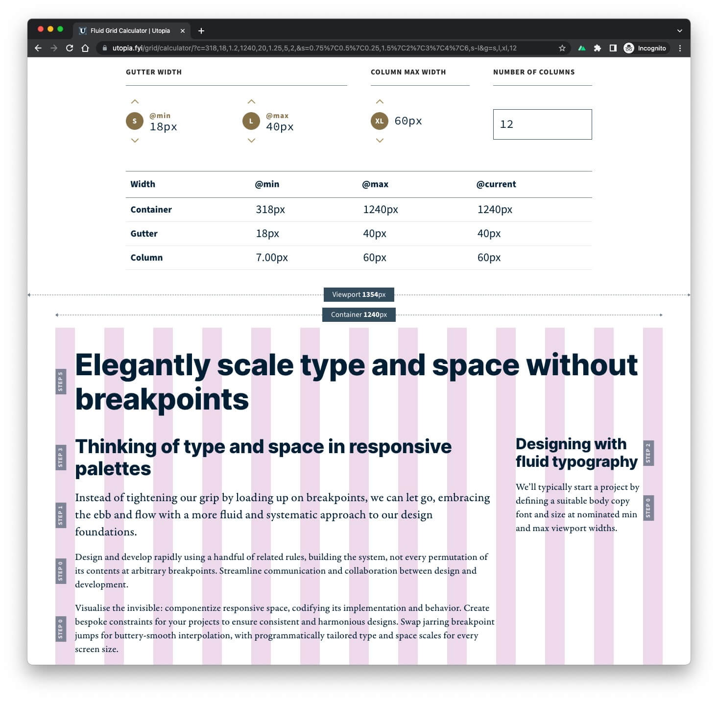
Posted on in WebI’ve been working with James on the new Utopia Grid Calculator, the latest tool in the Utopia arsenal. It asks for four pieces of information:
- Gutter width @min viewport
- Gutter width @max viewport
- Column width @max viewport
- Number of columns
Combining these four values creates a fluid grid:
Under the visualisation, there’s a CSS generator. On the first iteration, it included the line:
.u-grid {
  grid-template-columns: repeat(var(--grid-columns), 1fr);
}
That might seem reasonable given the user has just asked for X columns. But something didn’t feel at all right about that line.
When I said earlier that those four values created a fluid grid, that wasn’t entirely true. What we’ve created is a fluid container that can be used as a grid with fluid gutters. The columns inform the size of the container. But what you choose to do with that container is entirely up to you. A grid is a complex and nuanced beast that is so context & content dependent, that making assumptions within a tool like this is fruitless.
I’ve always avoided boot-windy grid systems. They’re heavy and designed for the ‘average’ website, never truly catering for the intricacies of your design. They provide all the classes in the world to push/pull columns at whatever breakpoints they deem ‘correct’, but without knowing what lives inside your rectangles, they are ultimately blunt tools.
The 12 column illusion
The grid is a designer’s tool. It assists in getting things to be the right size, and as Lex reminded those at FFConf, in balance. But the 12 column grid itself is an illusion, or at best a fading artefact of the emergent design.
We’ve settled on 12 columns, not because we necessarily need 1-3-7-1 layouts, but because it divides neatly and in multiple ways. It’s flexible. What we’re really looking for is halves, thirds and quarters to be rendered in context of the available space.
It all comes down to: fractions and the spaces between.
Utopia is concerned about the latter, about how your fractions slot together, and whether they feel in harmony with the overarching design. It’s why, by default, our grid calculator visualises gutters, not columns. Get the gutters right, and the rest will follow. Or as Alan Moore quotes:
‘I start with the space between the lines.’
Required further reading
If you’ve got this far, do read the entirety of gridless.design. Donnie D’Amato has done a remarkable job in articulating the flaws in the grid systems we’ve come to accept. Brad Frost has also recently written on the subject, specifically from a design systems' perspective. It’s well worth your time.
Posted on in Web