There it is again, that fluid feeling
Posted on in WebFor the first few years, the only way to add Utopian fluid scales to your site was to copy & paste the generated CSS. A “downside” of this delivery system is we have absolutely no idea who uses Utopia.
That’s both a feature and a bug. Knowing would mean we’d built some form of tracking system, which would make us responsible for up-time, performance and the ethics of surveillance (think Google Fonts etc.). So not knowing helps us sleep at night. However, on the odd occasion it’s nice for the old ego to see the work you contribute to actually being used in the wild and seeming genuinely useful for others. But short of people emailing us, we only find out by stumbling across a site in the wild, and nosing at the source code.
I recently came across Cotton Coder by David Bushell, and from the H1 scroll effect alone, I had a good idea that fluid typography might be in play. Checking the source confirmed it was Utopian. It was equally delightful to learn that Maggie Appleton’s supreme digital garden uses a fluid type scale.
Utopia doesn’t look like anything, and yet most sites employing a fluid responsive design approach are immediately obvious with a simple squish of the browser. Within 40px of resizing, I’ll have a pretty good idea I’m on a Utopian site. I find that wild.
James recently sent a link to Campfire, asking how they’d achieved their typography. Using a clamp on the body, they scale from 22px to 32px between 980px and 1440px. All type and space is then derived from this single clamp, using % and em. There’s a beautiful simplicity to this approach. With everything tied tightly to this steep base unit, resizing the browser feels like stretching the fabric of the site. Campfire sees your scroll-driven animations and raises you resize-driven scaling.
It’s fascinating to see this differences in this approach; I’d (generally) begin by designing for a small screen before scaling linearly towards a bigger screen. This approach (left-hand side of the below graph) locks in the small screen type all the way out till 980px before scaling rapidly through the final ~400px.
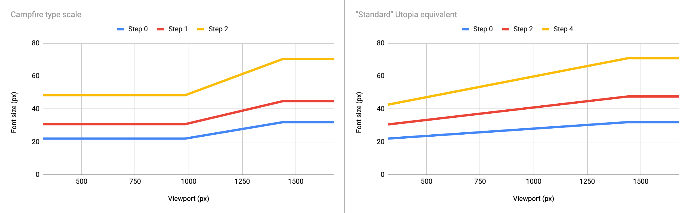
Their implementation does have a small accessibility flaw though: clamp(1.375rem, 2.225vw, 2rem). Because the middle “ideal” size uses a viewport unit directly, it doesn’t scale when you zoom within the browser, not to begin with at least. Once you get passed 150%, the site renders as if it’s on ‘mobile’ and the text size finally increases. You can achieve a similar result with Utopia, which mixes the vi unit with rem, which helps with those scaling issues.
Late on Friday afternoon, I was reading George’s fantastic guide to CSS round(), demonstrating how to combine fluid typography with a baseline grid. Knowing George works at Netlify, I had an urge to check the Netlify home page and give it a squish. To my utter amazement, it was fluid. Diving into the source, I found the tell-tale custom properties of a Utopian site 🤯 my mind was blown. I’ve been a huge fan of Netlify for many, many years, and we use Netlify to host utopia.fyi. To see our little open-source-ish tool being used on a site of this scale made me hugely proud.
There’s a load of exciting plans to keep expanding the Utopia universe, as much as (our somewhat limited) time allows. And although we now have a few generators now available, we have no plans to change that classic copy and paste delivery system.
Posted on in Web