Building a design system with Eleventy
Posted on in WebOne of the standout projects while working at Clearleft was collaborating with Malvern Panalytical to build the foundations of their design system. Four tech stacks within the business dictated that this system would centre around CSS, rather than language-driven component markup.
This decision gave us freedom to pick the most flexible stack for the design system, not forcing our hand to choose an off-the-shelf platform with specific language/framework support. Furthermore, we wanted a system that was beyond a component library; a true design system that could be used to articulate and accommodate brand, content and wider design standards.
Eleventy was the obvious candidate. Generating “pages from data” was the most compelling feature, and add to that the flexibility in templating and the rapid build times, there really was no other stack that came close.
Taking inspiration from Fractal; a project born from design systems projects at Clearleft, I wanted to build this system around component “context”. Context is a fancy word for the data that gets passed to a component to render it, and it allows you to render a component, and any number of variants by providing different data.
Mixed with the encapsulated macro pattern, we can demonstrate these components with ease, and with a consistent interface.
Demo design system
I’ve created a demonstration design system to articulate how this can work in practice. Feel free to fork the repository and tweak to your heart’s content.
Demo Design SystemScreenshots from the system
How it works
There are three key files in this design system (the links below go to the files in the repository on GitHub):
Key file 1: _includes/components/**/*.config.js
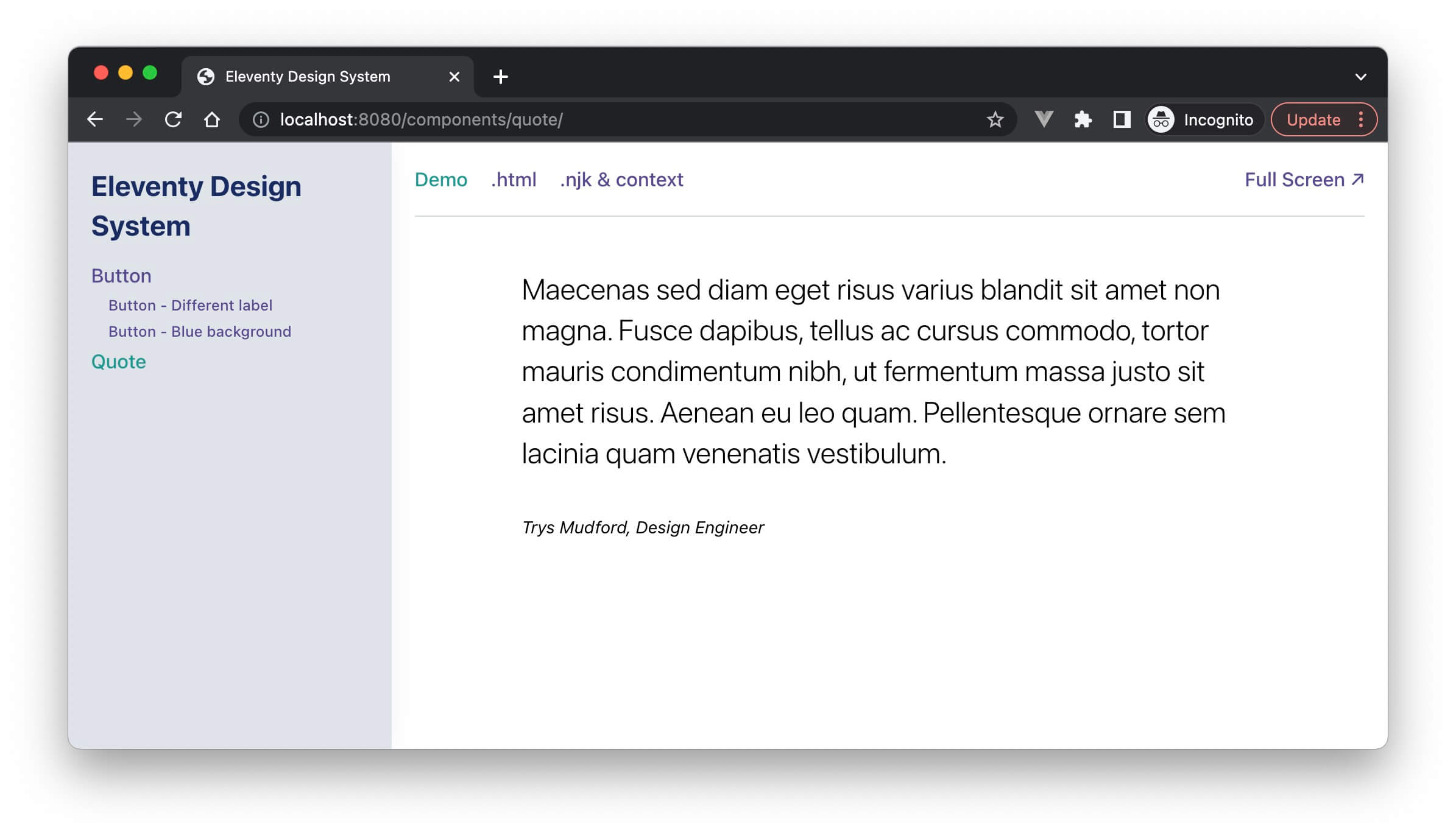
A config file is what flags each component to the design system. Here’s an example configuration for the quote component rendered in the screenshots above:
module.exports = {
  title: 'Quote',
  context: {
    body: '<p>Maecenas sed diam eget risus varius blandit...</p>',
    citation: 'Trys Mudford, Design Engineer'
  },
  preview: 'wrapper'
}
The title field is used in the sidebar menu. The context object is the data that’s passed into the component at the time of rendering. The preview field references the file that should be used to render the component. Most components are rendered in a full-width wrapper, but it can be useful to pop the component into a more realistically limited-width, or multi-column wrapper.
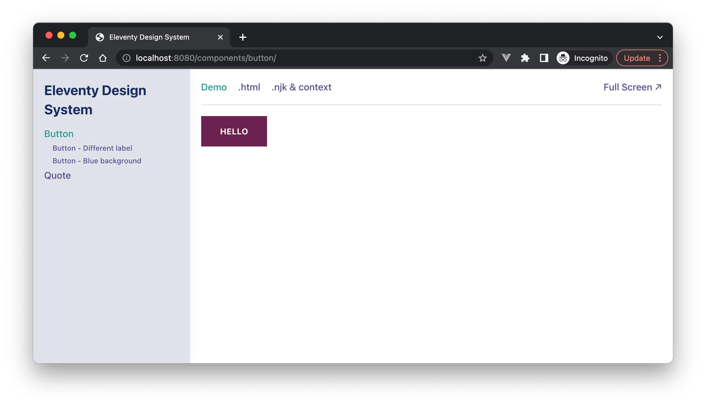
Now we’ve got this data format, it’s trivial to create variants of it. Here’s the button configuration:
module.exports = {
  title: 'Button',
  context: {
    label: 'Hello',
  },
  variants: [
    {
      title: 'Different label',
      context: {
        label: 'Hello, world'
      }
    },
    {
      title: 'Blue background',
      context: {
        colour: 'blue'
      }
    },
  ]
}
You’ll see the variants field format is a repeat of the parent component, but in an array, with only the differences in data from the parent passed in. In this case, either a different label, or a colour parameter. These pieces of data are then available within the component params variable to adapt to accordingly.
{# button.njk #}
{%- set classNames = "c-button" -%}

{%- if params.colour -%}
  {% set classNames = classNames + " c-button--" + params.colour %}
{% endif -%}

<button type="{{ params.type or 'button' }}" class="{{ classNames }}">
  {{ params.label }}
</button>
Key file 2: _data/components.js
JavaScript files in the _data folder are called at build time by Eleventy, to provide global data to templates. Usually, this would be used for API calls, gathering content before generating the website. But we can perform other asynchronous actions in this space, namely, reading from the file system:
module.exports = async function() {
  // Pull in all the config files
  const modules = await requireGlob('../_includes/**/*.config.js', {
    reducer,
    bustCache: true
  });

  // Convert the components into our required format
  const componentGroups = modules.components
    .map(convertComponent)
    .filter(Boolean);

  // Return the components and the menu
  return {
    components: componentGroups.flat(),
    menu: prepareMenu(componentGroups)
  };
}
The function convertComponent moulds the data from *.config.js into a usable format:
function convertComponent(component) {
  // Extract variants from component and remove them
  let { variants = [] } = component;
  delete component.variants;

  // Back out if the component isn't valid
  if (!component || !component.title) return null;

  // Set sensible defaults for previews & slugs
  component.preview = component.preview || 'default';
  const parentSlug = component.slug || slugify(component.title.toLowerCase());

  // Loop the variants, returning a merged combo of component, then variant
  variants = variants.map(variant => {
    const variantSlug = slugify(variant.title.toLowerCase());
    const preview = !!variant.preview ? variant.preview || 'default' : component.preview || 'default';

    return {
      ...component,
      ...variant,
      context: {
        ...component.context,
        ...variant.context
      },
      variant: true,
      preview,
      originalTitle: variant.title,
      title: `${component.title} - ${variant.title}`,
      slug: `${parentSlug}-${variantSlug}`
    }
  });

  // Return the main component and any variants
  return [
    {
      slug: parentSlug,
      ...component,
    },
    ...variants
  ]
}
So what we’ve done here is gather up all the config files, and serve them as one massive global array for Eleventy to work with.
Key file 3: components-full-pages.njk
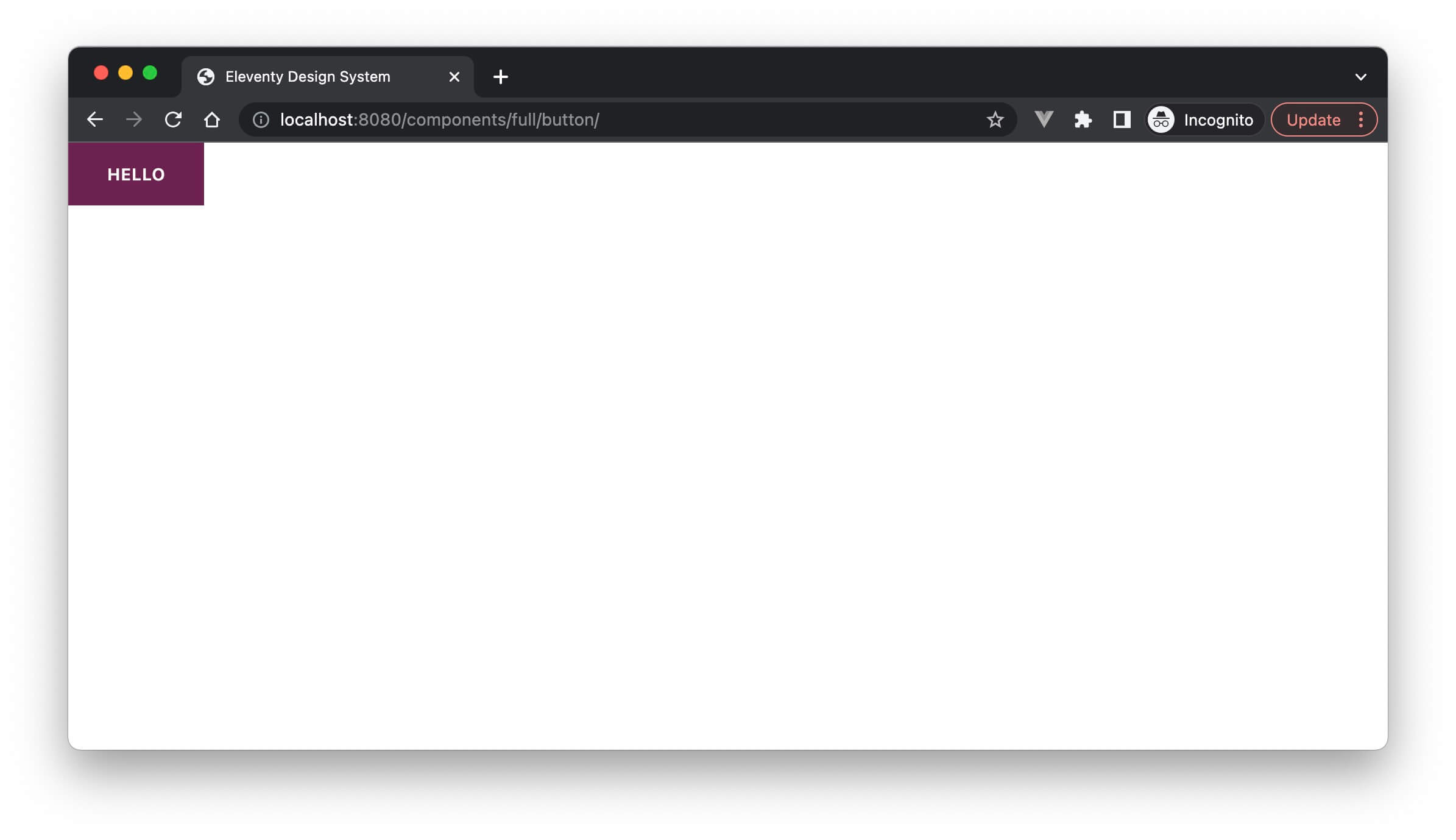
This ingenious little template from Eleventy loops around the data we’ve exposed in components.components (sorry, poor choice of variable naming there), and creates a page for every component and variant! It renders the component using the {{ c() }} macro, passing in the context, and it pops it within a preview wrapper.
---
pagination:
    data: components.components
    size: 1
    alias: component
permalink: "components/full/{{ component.slug }}/"
title: 'Components'
renderData:
  title: "{{ component.title }}"
---

{% extends "layout.njk" %}

{% block inner %}
  {% set comp %}
    {{ c(component.name, component.context) }}
  {% endset %}
  {% include "design-system/previews/preview-" + component.preview + ".njk" %}
{% endblock %}
And that’s it! Here’s what it looks like:
Designing the design system
Hang on; you might be thinking, that looks pretty different to the earlier screenshots? Well yes, but that’s for good reason. See, instead of rendering the component directly within a page in the design system, we render it on its own, and then include it via an <iframe>. This renders the component at the window size of the iframe, not at the size of the whole page. It’s a subtle difference, but when you’re working with viewport units or fluid type & space, it’s an important distinction.
The solution is another -pages.njk file. It starts off in the same way as the previous template, reading in the components.components data and rendering a page for each component/variant. For each page, we then output some tabs for the various views we want for the component.
{# components-pages.njk #}
---
pagination:
data: components.components
size: 1
alias: component
permalink: "components/{{ component.slug }}/"
title: "Components"
sidebar: components
renderData:
title: "{{ component.title }}"
---
{% extends "./_includes/design-system/library.njk" %}
{% from "design-system/component.njk" import code, context %}
{% block content %}
<seven-minute-tabs class="ds-stretch">
<ol role="tablist" class="ds-tabs" aria-label="What does this tab chooser do?">
<li><a class="ds-link" href="#example-tab" role="tab">Demo</a></li>
<li><a class="ds-link" href="#code-tab" role="tab">.html</a></li>
<li><a class="ds-link" href="#context-tab" role="tab">.njk & context</a></li>
<li><a class="ds-link" href="/components/full/{{ component.slug }}">Full Screen ↗</a></li>
</ol>
<div id="example-tab" role="tabpanel" class="ds-stretch">
<div class="ds-frame ds-stretch">
<iframe class="ds-stretch" src="/components/full/{{ component.slug }}" sandbox="allow-same-origin allow-scripts allow-forms allow-modals" style="" marginwidth="0" marginheight="0" frameborder="0" vspace="0" hspace="0" scrolling="yes"></iframe>
</div>
</div>
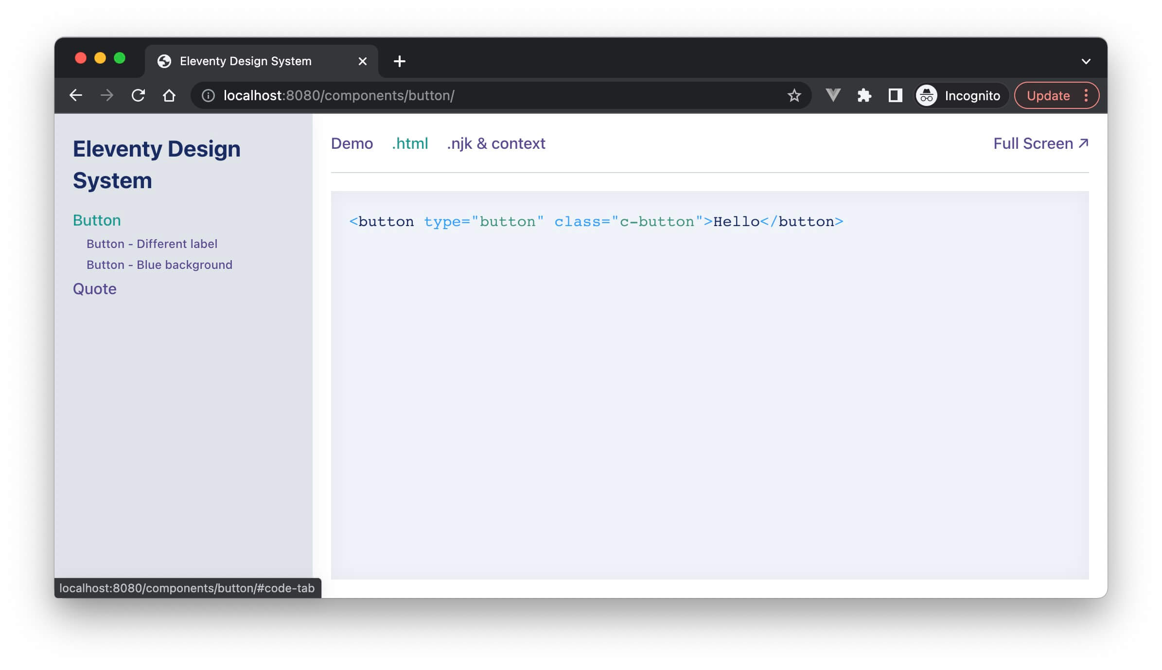
<div id="code-tab" role="tabpanel" class="ds-code ds-stretch">
{{ code(component.name, component.context) }}
</div>
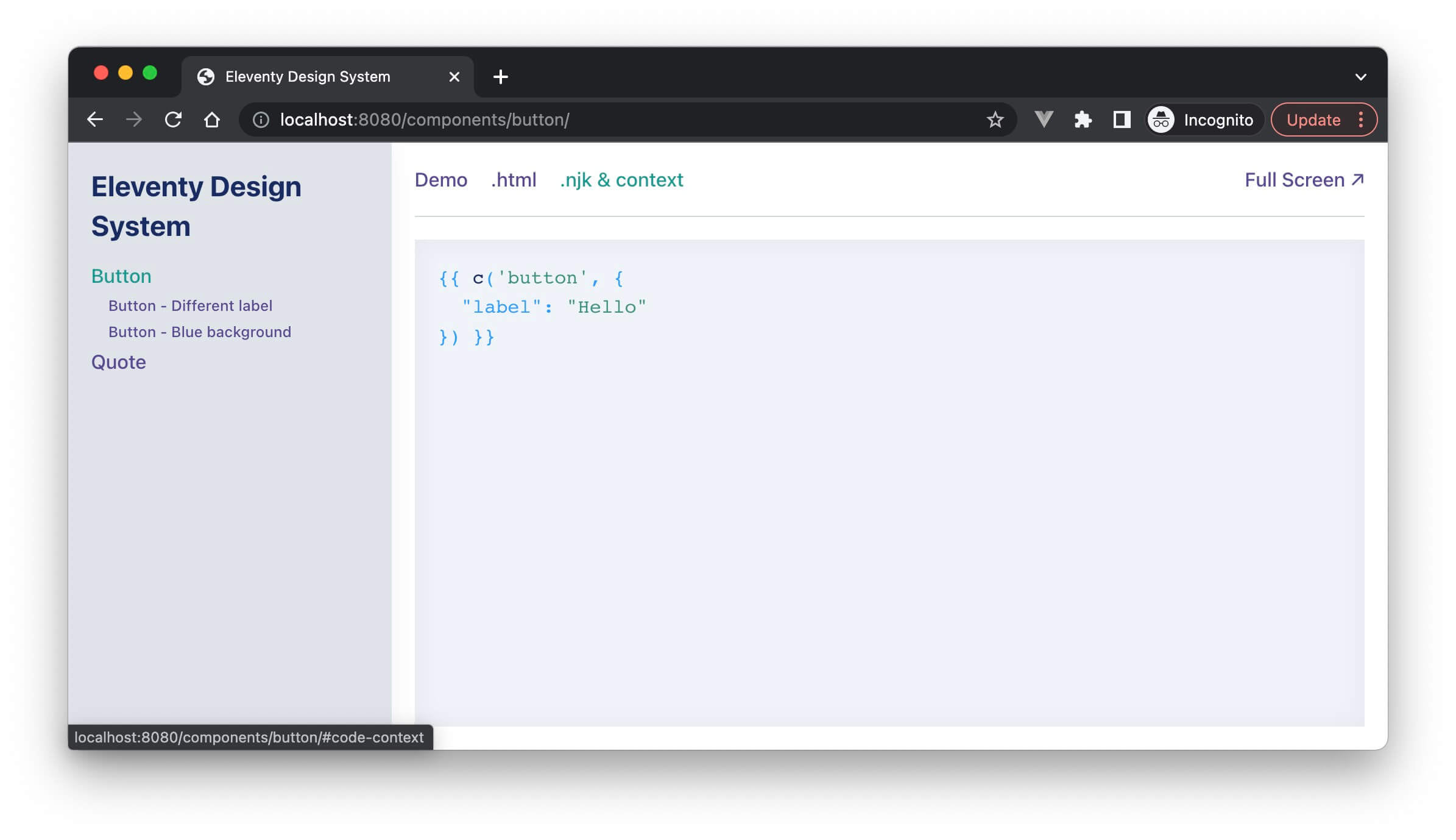
<div id="context-tab" role="tabpanel" class="ds-code ds-stretch">
{{ context(component.name, component.context) }}
</div>
</seven-minute-tabs>
{% endblock %}
In this case, I’ve got a tab for the visual demo of the component (housing the aforementioned <iframe>), a view of the generated HTML, a print-out of the context in use for the variant, and an option to see the component full screen. But this is only the start, we can render markdown documentation, prop tables, version numbers, stability labels, links to Figma, or whatever else takes your fancy.
The beauty of the *.config.js format, is you can pop in whatever data you fancy, and it’ll be available in this template. If your team has other requirements, you can easily adapt!
Styling the system
The final part of this example is a sprinkling of CSS to give the design system some form, and a sidebar to render the list of components, and any other associated pages of documentation. In the past, I’ve written about the systemised foundations, how to release the design system on NPM, and the decisions behind the CSS methodology, along with brand guidelines, tone of voice guides and anything else required to make this the home of digital design within a company.
You can get really meta, and use the components within the design system, to design the design system! If you’ve already designed buttons & tabs for your website, why generate another load of them for the system, right?!
If you have any questions on how this all works, or if you’d be interested in how I’d extend the system further, please pop me a tweet.
Posted on in Web