On Design Engineering: Systemised design foundations
Posted on in WebA phrase James and I like to use is “Designing design”. We like to start a project by creating a foundational set of instructions to govern the project, covering:
- Typography
- Space
- Colour
- Grids
These instructions are created and validated collaboratively through our two mediums: the design tool™ (currently Figma) & and the web browser. Implementing immediately in the browser allows us to:
- Check colour contrast on real screens
- Test site wrappers, gutters and ‘standard’ grid layouts at different widths
- Ensure the fluid typography feels harmonious, and scales to sensible sizes on small devices
- Deploy something to staging right away, testing our build system in the process
Are these design tokens?
Depending on your definition of design tokens, you might view these as tokens or not. I view them as foundational values that might drive design tokens. These foundations are very much ‘responsive web focused’; and being honest, I’ve never worked on an Android/iOS application that required a shared token system, so can’t speak with any authority on that.
While they are named and application-agnostic, they are not language agnostic so I’m still on the fence as to whether they are design tokens or not. Anyway, that’s semantics.
Systemised design foundations
It’s tempting to lift foundational values (font sizes, hex codes) from Figma, and drop them straight into your code. But we’ve found it far more efficient in the long run to mimic the ‘system’ that comes up with the final results in code.
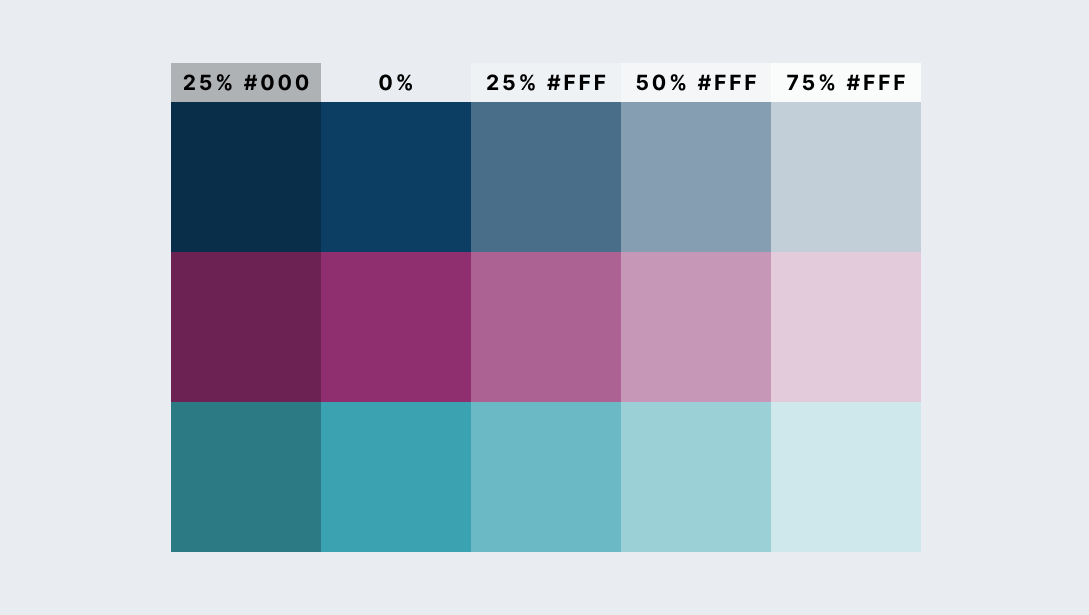
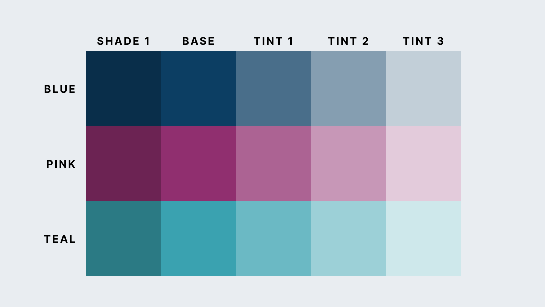
Take colours as an example. One way to create tints and shades of a base colour is to overlay white/black with differing percentages of opacity. This is pretty easy to do in Figma with two circles:
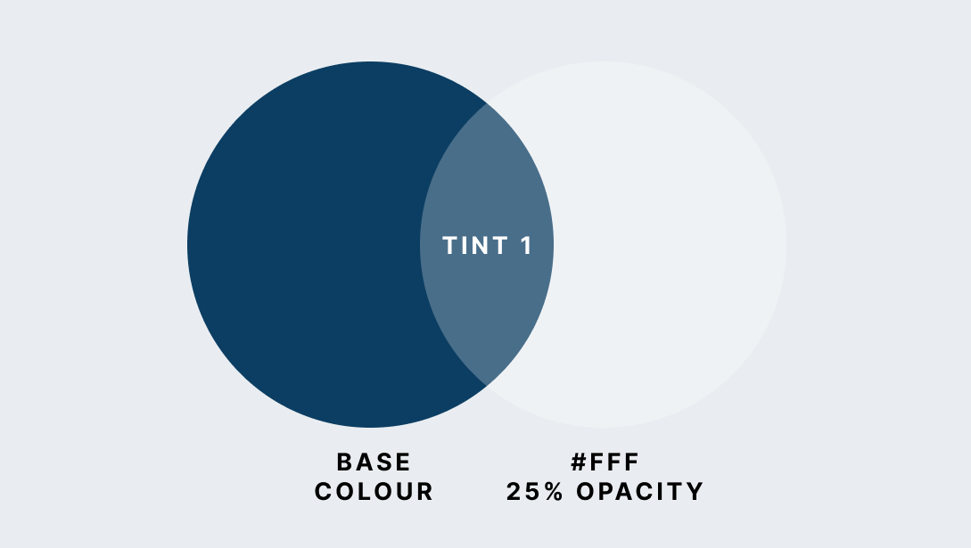
To translate this into code, we could use a colour picker on that central lighter colour and grab the hex code directly. If there’s only one colour in play, that might be an appropriate amount of effort. But what happens when there are more tints, and more base colours? What happens when you decide the base colour is too dark, or your overlay tints should be at 30%, 65%, and 95%?
One item is an entity, two could be a system, three should be a system.
Fortunately, it’s possible to automate these sorts of tasks with SCSS:
@function colour-mix($background, $mixer, $percentage) {
  $percent: alpha(rgba($mixer, $percentage)) * 100%;
  @return mix($mixer, $background, $percent);
}

$brand-blue: #0C3E63;
$brand-blue-tint-1 colour-mix($brand-blue, white, 25%);
This isn’t to advocate this exact way of working, that should be decided by your own design process. This is to suggest:
- Automate where you can
- Start thinking in systems from the smallest atomic size; structure and logic will follow you through the project
Why systemise your design foundations?
Building a small system for the four foundations, over a hard coded config file of magic numbers is helpful for a number of reasons:
1. Creating a palette of named foundations produces a positive ‘friction-point’
Let’s say an engineer has been handed a design with a minutely different font-size to the last template. If they’re new to the team, or hold the design team decisions as gospel, they might well add the new size to the site, despite the fact that that could’ve been an honest design mistake slipping through the cracks.
But with shared foundations and explicit names for each size, not only does the system provide the grounds and confidence to push-back and check, it more importantly provides the common language between the developer and the designer to prevent it from happening in the first place.
One rule that has held us in good stead is:
Before adding to a system, first consider whether anything similar exists, and if so, can the design can be adapted to use the system after all.
This sense check helps to keep things consistent and prevents sporadic additions to the system. The smaller the system, the easier it is to hold in your head and utilise.
2. You can tweak the system to generate interesting new possibilities, inspiring new design.
Testing for colour contrast, grid efficiency and font-sizes across devices is best done on real screens, and the quickest way to come of those decisions is to tweak them live in the browser.
This idea of tweaking the system, not the outputs fed into Utopia, where you’re able to change the type scale, base unit and viewport sizes, and let the system create the values. Being declarative and ‘letting the computer decide’ is a fundamental part of how CSS works. Build upon tools that embrace this mindset.
3. It empowers developers to design
The most exciting part of being a design engineer on a project is the truly fluid design & development process. The shared system has allowed me as a ‘developer’ to design full page templates in the browser, and see them pulled back into Figma as the design source of truth.
4. Engineers are ‘systems thinkers’ - build them a system
Creating this backbone of logic will go a long way to bridging that gulf between the subjective and objective1. I believe that the more ‘system-y’ your design is, the more accurately an engineer will recreate it. If you can explain the logic that goes into a design decision, other designers and engineers are more likely to apply the same pattern for similar use-cases.
The power of common language
There is huge power in a common language between design and engineering.
Common language creates unity, and sense of shared purpose on a project. It brings consistency to the user interface, and to the codebase. It prevents wasted effort generated from needless duplication. It reduces doubt around the understanding of design intention.
If you were to take all the components away from a design system, and leave only the foundational common language, I believe it would still be a very helpful tool—in my opinion, a design system is way more about the ‘team benefits’ as it is about making the interface consistent. As Jeremy considered in the first episode of the Clearleft podcast:
Let’s say your company has a design system manifested in the designs code and documentation for all your product’s interface elements. Now, what would be worse: if everyone in your company suffered collective amnesia about your company’s processes and priorities, but your design system remained intact? Or would it be worse if everyone retained that knowledge but your library of components disappeared in a puff of smoke? Jeremy Keith
How to document design foundations
Each pillar deserves it’s own page of documentation. This could be in a Wiki, in Figma, or ideally, in your design system. For each concept, cover three topics:
1. Implementation: How would we use this?
The specific implementation details are project-specific. You could manage space with a SCSS mixin, Custom Properties could hold your colour calculations, a JSON file might hold your type scales. But here’s an example of some short documentation on a SCSS function:
SCSS function
The color() function takes two arguments, one for the colour and one for the shade/tint. The full list of brand colours, tints and shades can be found here.
.c-component {
  background: color('blue', 'tint-3');
  color: color('green');
}
Utility classes
You can also use utility classes to apply colour, with one set for the color property, and another for background-color:
<p class="u-blue">Blue text</p>
<p class="u-bg-green-tint-1">Green tint 1 background</p>
2. Demonstration: What does the result look like?
Demonstrating these principles is key to adoption. A live example is usually clearer to understand, then a purely theoretical one.
For colour, that could be a swatch:
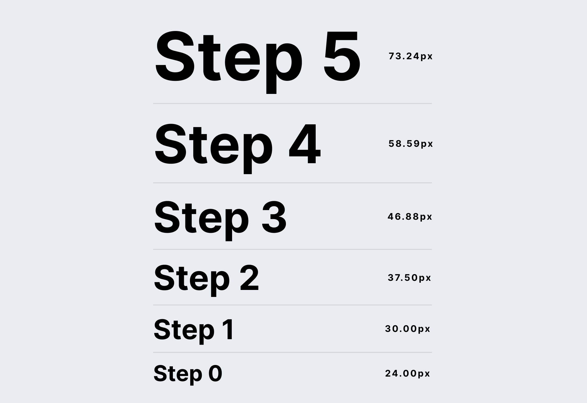
For typography, that could be a type scale visualisation:
3. Rationale: Why did we come to these decisions?
Finally, describe how you got to this point. Were there any user testing or analytical insights that led to this decision? For example:
-
Design and engineering ↩︎
Posted on in Web